Labels

Friday 17 December 2010

Digi Packs

What is a Digi-pack?
A "Digi-pack" is a CD package which is promoting the Album and representing the artist/band. It is usually made out of cardboard which when opened, it folds out, and the CD is usually in the middle.

What makes an effective Digi-pack?
  • A colour scheme and/or design throughout.
  • Cover Art/Illustration to grab the viewer's attention and interest.
  • Folds out or into an image.
  • Contrasting and strong colours; again to get the audience's interest.
  • Theme throughout the digi-pac.
  • The concept either simplistic, or one which purposely stands out (Strong) dependent on the genre.
  • Photo's of the band/artist. (usually used in some of the panels)

Planning Task 13) CD Cover designs 2


We have decided to name our artist "Madelyn Faith" as we felt that this name is feminine and has a slight 'ring' to it. We also have said that this is similar to other female artists such as Duffy, Kate Bush and how they've just used their name to portray their stamp to their music.

These are the fonts we have picked out that are most suited to our genre.

We agreed that the first font -- Quilted Butterfly is more suitable to our chosen genre because it has a "Alice In Wonderland" look and it's quite abstract.

Tuesday 14 December 2010

Planning Task 13) CD Cover designs

In this lesson, myself and Laura created two examples of potential digipacks. After discussing what designs we should include, we decided to pick out the best parts of the digipacks and to choose how good it may look once created. We have a number of ideal aspects of which we will definitely include in the digi-pack.

- Pale pattern or pale colours through out
- Have a "vintage" feel and look
- May use polaroid photographs (may have to resort to a editing software to successfully do this)
- Establishing shot/ close up of the artist wearing mask.
- Portray the artist as pale looking, wearing flowy outfits.... edited in Photoshop (overlay/exclusion of warm colours)

Tuesday 7 December 2010

Merchandising


http://sleevage.com/the-white-stripes-icky-thump/


This is The White Stripes merchandise products. They have created illustrated memory sticks which fans can buy and use for everyday use. I find that merchandising is extremely important when it comes to creating a digipack, so that it can be another step for new artists to become popular. This may be a potential idea that my group can do, if there's enough time.

Research Task 16) CD Cover research


Album cover/ Digipack Influences.

Fabulous Diamonds: 7 Songs. This album cover struck my attention because this photograph is so simple, yet very strange. I wouldn't use something like this as the artist is solo and not a duet.


I really like Santogold's album - contrasting Black & White and how she looks like she's vomiting glitter - it's giving out the feel that she's glamourous and has a slight edge. Very simple theme, and the font fits in with the genre.

I also liked Vega4's "You and Others" - very relative to my artist and the genre, with the simple photograph of forest trees.

Tuesday 30 November 2010

Comparing Media Blogs

Looking through a "longroadmusicvideo" blog, I realised that this blog has a lot of descriptive text posts, and have used a lot of music videos and created their final music video, and their finished digi-packs (in which we have not yet done)

I have made a few comparisons from their blog and my own.

WWW
  • Looking through their blog, they have used many videos contributing to their ideas, and have used a broad range of example artists and had influences by analysing a range of album covers.
  • Mine is quite similar, as I have used a range of music videos, and album covers in order to gain influence and inspiration of what to include in my music video.
  • Also, their blog have included magazine posters, and front covers, and CD covers.
  • In comparison to mine, I have done this, but not to an extremity - I've only included certain music videos, posters, CD covers which are in relation to my ideas.
  • Also, I have a theme running through my blog, whereas their blog is slightly jumbled.

EBI
  • Their blog has too much text posts, which it would be tiring for an examiner.
  • My blog could include more music videos, influences, digi-packs with explanation/ referring to my ideas.
  • Their blog has included film stills - something I could do when filming.
  • Their blog has photoshopped testers and outcomes- something I could do in the future.

Tuesday 2 November 2010

Planning Task 18) Track Permission letter

This is the letter that Laura had written for Island Records, as the song we want to use has been published by this company. There wasn't an email address, so that's a disadvantage, and the only way was that I had printed a copy off, and myself and Laura signed our signatures and I sent the letter off. We needed to write this to the record company as we would be "stealing" the song.

Planning Task 15) Photoshoot Plan


We have decided to go by this plan as we need a variety of film footage, and lots of photographs to conclude the promotional package.

Planning Task 14) Advert Designs


  • For my ancillary task, I was set to create a "one off" venue poster for our artist Madelyn Faith. Here are some photographs showing what I've done and the result overall.


  • This is me making adjustments to my artist advert design. You can see it's almost finished but I needed to experiment with filters to bring out a more subtle, and dark tones to be in contrast with Laura's lighter design.

I decided that I needed a dark blue "exclusion" filter to complete the advert poster. To do this, I pressed 'cmd' and 'a' to select the whole advert. I then right-clicked onto the advert and went onto 'fill' > then 'colour', then it went onto colour selection and I chose to use dark blue.


  • Here is the final design! I think the poster overall represents a darker, twisted side of Madelyn Faith. The effects I have used (such as lens flare and exclusions) generally fit in with the concept and chosen genre of our artist (genre being indie-pop/baroque-pop)and it fits in with the conventions of genre. This poster creates a feeling of bitterness, whereas Laura's poster is the opposite of mine.

CD cover designs and Influences


During this lesson, myself and Laura have gained a number of ideas which will contribute in making our CD cover. By looking at sleevage.com, we have looked at a number of albums including Ladyhawke - what interested me, was by the simple use of using an editing software; i.e. Photoshop, and the concept of the album is shown by it's "arty" flare, which caught my attention in perhaps using a similar theme for my album cover.


Also, even by using one photograph and using subtle text over could be another essential idea for the CD design - which I looked at Yeah Yeah Yeahs' "It's Blitz!", whi
ch I found the layout to be appealing, and that the yellow paint has a significanteffect. The idea of using a simple photograph, and the use of editing software which will make the picture appear professional, simplistic.


Planning Task 12) Shooting Schedule

A shooting schedule is a table which shows the dates and times when a group is expected to film a music video. I have made one to keep organised and to know what exact props and costume I will need to bring on a specific day.

Planning Task 11) Location Shots


After finding influences from the pre-Raphaelite paintings ('Ophelia' - John Hughes 1852; 'Lamia' - John William Waterhouse 1909), myself and Laura had decided that we would be basing our location in parks or forests; as the season is autumn and drawing into winter, this would be a perfect and ideal location to set the video; as these locations will look very "dreamy", and the colours will be a golden-orange, and even using different colour filters, this would make the video appear professional when used correctly.

Nonsuch Park would be the ideal location to film the music video. (As it isn't too far) I had looked at these photos of Nonsuch Park (credit to Miss Cunliffe) and there are a number of good locations to use within these pictures, as they create the dreamy, autumnal feel that we are going to be depicting in the future music video.


I have chosen this photo to use as a potential location setting as it fits in with the theme, it's quite enchanting and mysterious; and almost looks like a painting, and the path way and the neat circle is also quite illusionary.


I also like this photo, also another possible location to use when creating the music video; there are many wonderful trees in this park, and could be a possibility to use a few trees when filming.


This photo has natural lighting, the purple light could create a filter when filming, if we were to use the technique. However, it is a good photo with the surrounding trees.


Planning Task 10) Props, Costume, Make up, & equipment.

The costume and make-up that is going to be used in the music video will be a variety of clothing, ranging from flowy dresses, using materials such as lace, and laced accessories e.g. masks, gloves, pins. The artist will appear to look very unique, and have my own 'mark' on the music - like Lady Gaga (mask-wearing). As i'm camera shy, covering my face with masks will have a significant effect both on the concept and raise curiosity for the audience as to who she is.

Planning Task 9) Storyboards


I have created a storyboard, because it will be the main source of our music video shooting ideas. Also, it keeps the list organised, so we would know what to bring and the location we need to be on a certain day. Also, we can always change our ideas or expand on it.

Planning Task 8) Concept

The concept of our music video will be influenced by a number of different shots as myself and Laura are quite shy, and so by using a variety of camera techniques and different shots, this music video will turn out well - we'll be using masks, bizarre outfits, and low key lighting to show the artist in a different light.

This mask technique can be seen in a number of music videos, in "Look Blue Go Purple - Circumspect Penelope" in which the artists are performing in masks. Also in "Little Secrets - Passion Pit"; people are wearing paper bags with faces on their heads, and this is showing that many music videos are now modern and contemporary.


Planning Task 6) Image Annotation


I would want my artist to be inspired from these female artists. Lady Gaga for her eccentric fashion style and her use of wearing masks in her videos. Florence Welch for her image of pale, red hair. Kate Bush with the element of nature, twinned with all three women, but made as an adaption, not a copy.

Sunday 17 October 2010

Research Task 13) Genre Research 1


"I'm like a virgin losing a child" - Manchester Orchestra's first album. (Genre: indie-rock)

The concept of this album looks very much like an event depicted from teenage years and such, with the pink overlay added, it is giving out the feeling of remeniscience - possibly the intended theme.

However, the setting is in a bedroom and looks as if a young woman is turning the tv on/off. Very simple but easily explained as it must reflect the music thus giving out a very insightful, spiritful and even a nostalgic feel as a whole.

Research Task 14) Genre Research 2

"Plans" is the fifth studio album by the band Death Cab for Cutie. The genre for this band are classified under indie-pop and alternative rock. Also a continuation, or sister album to Transatlanticism, the previous album.

From what it looks like, the background is slightly blurred, possibly a building and the foreground of a top of a tree, being the main focus as well as the typography "PLANS" being upfront yet striking. Vignette effect around the corners giving out a pessimisstic and dawny/autumnal vibe, also relaxing, generally giving off a mature, charismatic feel which may consistently excite those who like the band!

Ben Gibbard (leading frontman) has quoted (about the theme) "
I don't think there's necessarily a story, but there's definitely a theme here. One of my favorite kind of dark jokes is, 'How do you make God laugh? You make a plan. Nobody ever makes a plan that they're gonna go out and get hit by a car. A plan almost always has a happy ending. Essentially, every plan is a tiny prayer to Father Time. I really like the idea of a plan not being seen as having definite outcomes, but more like little wishes."

Overall, the album cover is relevant to my selected genre as "indie"; as there are rarely a photo of the band displayed; usually a photo like this with light coloured fonts - can be easily made for a low budget music video! (that was why I chose this particular album.)


Friday 15 October 2010

Planning Task 3) Technical Tutorials


This is a screen shot from Final Cut Express.

In this lesson, the group had experimented with the green screen and lip syncing to a song and then used final cut express and played around with the edits. I learned overall how to use a green screen, as it brought up possible ideas of what I could do when I start creating a music video. I find Final Cut Express quite difficult technically, but when I started editing, it became easier the more I was comfortable with using the program.

Photoshop edits


After I had taken photos, I went onto Photoshop and created an example album cover, in some relation to the theme - I do like how it has formed with the head pattern, creating a trance look, not really in relation but it could be used in future ideas perhaps - sort of like the discography relevant to band Crystal Castles.
(THIS IS A FIRST DRAFT) <<<<<

This is the finished album cover design. Could be a possible design with the copied heads for a more alternate look.


Planning Task 4) Song Details

The song that the group will be using is "Blinding" by Florence & the Machine. We have decided to choose this song because she is linked into the chosen theme which is "indie" but she is classed under the genres such as indie-rock, alternative, soul, baroque pop and art-rock.

We have decided to use this song because it has mentions of snow white and the image of the tortured, distorted pale woman image and the song style is like being in a twisted dream state. (thus it being the season autumn, and the song focusing on "dreaming like the dead" and being "blinded") the warm colours and dying trees would be the perfect solution in creating the music video.


Planning Task 2) Roles

There are only two people in my group, and that is myself and Laura.

We will both be involved in this music video and we will most likely to be sharing the role of using the camera and taking part in the music video, and that we would be planning what goes in the video, by planning and creating storyboards. Also, we may be doing seperate roles as well - i.e. I may bring in the costume, whereas Laura may download the song, etc.

Planning Task 13) CD cover designs 2

In this lesson, we took advantage by using photography to give the audience an idea of what our future band will look like and to give an impression of what genre we fit in. These are a few example photos that we had taken.

    Here are a few example photos; the positioning is suited to the chosen genre and its giving out a sense of independance and a slight edge (if used in photoshop) ... thus we have found inspiration from the likes of Florence and the machine (the intentional artist), Ellie Goulding, Soko and many more. Also, the facial expression is unreadable, which may give the impression that she may have an unhinging "vulnerability".

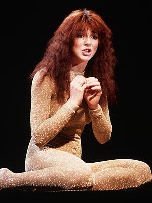
    At this point, we were unsure of who to use as the main artist, so we had used this time to take solo photos of each other, in case we change our ideas. Another point is that we had discussed performing in a group, but that was dismissed as there are only two people in this group.


    Monday 4 October 2010

    Analysis of 2 music videos

    4 Sour - Hibi No Neiro
    • The style/concept of this video is very contempory and modern as it is set out like a social networking website and there are many shots set out as people communiticating to each other via webcams - one example of which four people are taking photos of each other yet they are in different locations. What I like about this personally is that this is very simple to do if someone is making a low budget music video and this has given me another perspective of how to construct my own music video. Also, there were not many shots used as there was one main narrative running through the video. Overall, I quite liked the theme and the simplicity throughout.
    • What I dislike about this video is that there was a background story, and I like individualistic, original music videos, it didn't give me the "wow" factor.


    8 Pop Levi - Semi Babe
    • Not what I had expected - the style is a little too simple for my liking, but it looks as if a lot of effort had gone into the making of the video. There are no cuts or edits used; just one long frame used of a few people playing instruments, which is giving the audience the sense of dullness, yet intriguing as something else may happen (which nothing did happen). The style is simple, but more work should've have gone in - e.g. use different settings, locations, costumes, and more singing as it was a really late duration - almost 3 minutes! And what disappointed me again was that the man in the red jacket sang "Semi babe" and went away! There were hardly any lyrics used and that is uncommon (unless it were a post-rock band performing, such as Sigur Rós, who are well known for their use of made up language "hopelandic" containing no lyrics throughout some songs to express a feeling or emotion) and because the no lyrics used in thisvideo, I was disappointed and bored of the whole narrative and the performance being plain.


    Friday 1 October 2010

    Planning Task 1) Initial Ideas


    Nina Ricci advert


    The initial idea for our music video is that myself and Laura are going to use the song "Blinding" by Florence & the Machine, and this is influenced by the Nina Ricci advert with the autumnal colours and theme going through it, using washed out, distressed colours which could suggest that this is slightly twisted - also main focus is the apple (in relation to Snow White). It also has a red tint through out the advert.

    Florence Welch - Singer for Florence and the Machine.


    I have discovered that Florence is modelled to the likes of Kate Bush and Tori Amos, all having pale skin, red hair, and the performance in their music videos show a slight sense of bitterness and the representation of "the tortured, beautiful, twisted woman". Also in relation to "Ophelia" by Millais, a Pre-Raphelite painter. Their style of music is eclectic and very abstract in comparasion to the mainstream music that is out at the moment, not many people can get away with this impression if they do not have these features as of which these people have in common.


    Kate Bush was recognised from the song "Wuthering Heights"


    Tori Amos was known for the release of " Cornflake Girl". Inspired by Kate Bush, and then Florence from Tori Amos.

    Research Task 19) Audience Research 2 (analysis)

    So the results show that the RnB genre is the most popular genre, and Indie coming in second. Also, the results show that people prefer to watch music videos on TV rather than Youtube, which was unexpected. The bar graph indicates that 90% of people questioned watch music videos everyday and lastly it was 50/50 when we asked people what makes people watch music videos, resulting in abstract and performance.

    Regardless of what the results show (that RnB is the most popular), my aim is to create a music video that isn't going to be stereotyped, degrading (e.g. professor green ft. lily allen, lots of girls dancing promiscuously) hopefully, this music video could be like an art piece, becoming very abstract and different to the typical music videos which are out at the moment!

    Tuesday 28 September 2010

    Research Task 19) Audience Research 2


    These are the results from the respondents in which myself and Laura asked sixth formers a number of questions to fill in on the questionnaire we'd given them. There were multiple choice answers; such as "What is your favourite genre?" and the majority of people put down RnB.

    Research Task 18) Audience research 1


    This is the questionnaire I had used to conduct the study.

    Friday 24 September 2010

    Research Task 1) Brief

    The task I have been set is to create a "promotional package" for the release of an album, and to include a music promo video together with two of the three options:

    - Website homepage for the band/artist
    - Design a album cover for the band
    - Magazine advert for the band/album

    The aim is to create your own artist, and using the original song, but recreate the artist for the music video.

    Research Task 17) Record Label research 1


    Island Records is a record label that was founded by Chris Blackwell in Jamaica. It was based in the United Kingdom for many years and is now owned by Universal Music Group. The label now operates as a division of The United Def Jam Music Group in the United States and as a standalone label in the United Kingdom (also known as Island Records Group or Universal Island).


    • Myself & Laura have decided to use Island as our record label due to their vast range of popular artists, who were previously not well known. Artists such as Ladyhawke, Florence & The Machine, Tori Amos, Bombay Bicycle Club, The Killers, and Brandon Flowers are all associated with this label and I felt that our artist would be well suited to this record label.

    Research Task 17) Record Label Research 2


    Rough Trade Records is an independent record label based in London. It started in 1978 by Geoff Travis. The label grew out from Rough Trade Shop in West London after records found in North America and shipped back to the UK and then became independent in 1982 but went bankrupt in 1991 and re-launched in 2000. Rough Trade specialised in European post-punk and other alternative rock.
    Many bands are signed to this record label, a wide variety. Arcade Fire, The Libertines, The Moldy Peaches, Mystery Jets and The Strokes are signed.

    Research Task 17) Record Label Research 3


    XL Recordings is a British independant record label which was launched in 1989 by Tim Palmer, Nick Halkes and Richard Russell, with Beggars Banquet Records to start launching Rave and Dance music. The label has grown into one of the most commercially successful and influential independant records in the world.
    XL Recordings have moved on from Dance and Rave music, and had recently starting signing into other genres such as freak-folk, alternative rock, hip-hop and UK Garage. Also, they have signed into the indie genre. They have signed up a range of bands such as Basement Jaxx, Friendly Fires, Sigur Rós, The xx, Dizzee Rascal, Radiohead and Vampire Weekend.

    Friday 17 September 2010

    Research Task 10) Theories 2 (Vernallis)

    Carol Vernallis' theory explains the "kindest cuts" functions and meanings in music video editing.

    Editing in Pop videos: The editing must keep the audience in the present moment e.g. aims to stop the audience from focusing on the image rather than the music itself, or music over image.
    Uses small sections of continuity editing; montage and juxtaposition. The rules od continuity editing are usually broken. There are, however, shots that compare up in a complimentary way such as edits that anticipate a gesture in a shot that tracks through. e.g. shot of artist dancing and fast edits are used inbetween.

    Graphic match is also used in pop videos
    Shots such as the dolly, track, high angle shots are the most common to use in Pop videos.


    Alejandro is a good example that matches to the theoy due to Lady Gaga as there are constant use of track and quick cuts used in the video. It also fits in with the theory due to her constant change in costume.


    Research Task 11) Theories 3 (Goodwin)