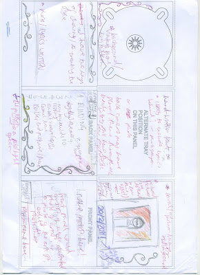
 In this lesson, myself and Laura created two examples of potential digipacks. After discussing what designs we should include, we decided to pick out the best parts of the digipacks and to choose how good it may look once created. We have a number of ideal aspects of which we will definitely include in the digi-pack.
 - Pale pattern or pale colours through out
- Have a "vintage" feel and look
- May use polaroid photographs (may have to resort to a editing software to successfully do this)
- Establishing shot/ close up of the artist wearing mask.
- Portray the artist as pale looking, wearing flowy outfits.... edited in Photoshop (overlay/exclusion of warm colours)
No comments:
Post a Comment