Before the music video was created, it had derived from the ancillary tasks, which I constructed a "one day venue" tour poster, at the Koko club in Camden Town. I decided that this venue was best for our upcoming artist, as she is new and contemporary, and which the tour date would come after, which this poster was made by my partner Laura.

- If you were to look at both of the posters we have made, you can see that the posters are polar opposited; they seem not to be by the same artist. Usually, if an artist was to announce tour dates and venues, they would go by the same theme and concept. However, we have challenged and developed this approach by contrasting our pieces, which relatively fits in with our work overall. (Laura's poster is quite light in colour and text, and used a lighter photograph). The only element that combines our pieces together is the font we have used (Quilted Butterfly -dafont), yet they also differ in colour, but it does not matter, as the artist is then seen as having split personality, traits, tendencies.
- What I like most about the poster I've created is that the effects I used on photoshop (dark blue overlay, the swirly vector on the text, etc) to make the concept of nature and surrealism fit in with the chosen genre. The dark tones creates a feeling of coldness, a darker side to Madelyn Faith -- which the other poster defines the eccentric side of her. This combination of opposite colours and no matching theme apart from using same font would be considered quite bizarre.


- When creating my half of the digipak, I kept in with the concept of nature and a surrealist vibe. I got to create the front cover, which is an establishing shot of the artist, wearing a mask. We have also developed and challenged real media products as we have used a constand, reoccurring prop that is vital to the artist, in terms of shyness, and brings curiosity to the audience to discover who is she is, and why she wears it. Typically, there aren't many artists who wear masks during performances or music videos (apart from metal bands and Look Blue Go Purple?) in terms of cinematography, I find this photograph to be very bold and strong, acknowledging the artist's appearance in one go. The font is the same as the posters, which I subtly included just underneath. It looks better not being bold and clear as we wanted to attract the audience to the artist's face and the tree branches being overlaid over her face and chest, which is again hinting at beauty and creepy traits, linking to nature, also showing a sense of freedom.
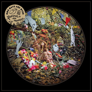
Florence & the Machine's front cover of "Dog Days are Over" is one inspiration of the digipak.

- Overall, I find my contribution to the finalised digipak to be a success, in terms of concept, and keeping in with the forms and conventions of using real media products which has emphasised my mediatic creativity of being able to make a professional looking digipak. The effects are very idiosyncratic and eccentric, again highlighting key aspects of the artist, and by using these experimental techniques, lots of overlays and exclusion tints, adjusting exposure, manipulating the artist's face etc, has really brought out almost a new "look" and the digipak and experimenting with our cinematography, I feel that this has brought me up onto a new level in creating and analysing my work.
If you can include your digi-pack images and your poster here that would add further visual evidence to your analysis. At the moment what you've said is good but we have nothing to see to fully understand you! JIN
ReplyDeleteCAN YOU INCLUDE YOUR VISUAL REFERENCES. JIN
ReplyDelete